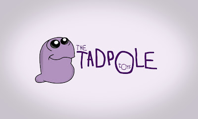
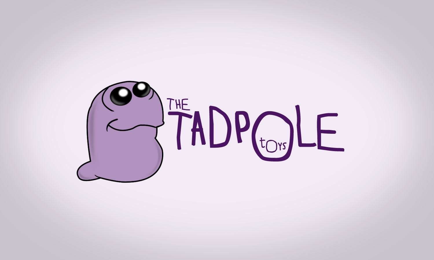
The Tadpole Logo another "bastard child" from the same meeting. The sketch was so much cuter than the logo...Or so I suppose! But the over all logo design turned out just the way I visualised it to be. Even the Violet shades! The 'toys' was later added though. I felt it too be too cute and wanted kids to adore this little tadpole...usually I felt they are gross! :D
Font used: Two Turtle Doves
 Find it here:


No comments:
Post a Comment